CSS shaders
23 October 2011
- Editors:
- Vincent Hardy, Adobe Systems, vhardy@adobe.com
- Dean Jackson, Apple
Inc., dino@apple.com
- Erik Dahlström, Opera Software ASA, ed@opera.com
Copyright © 2012 W3C® (MIT, ERCIM,
Keio), All Rights Reserved. W3C liability,
trademark
and document
use rules apply.
This
specification is not being actively maintained, and should not be used as
a guide for implementations. CSS shaders are an integrated part of Filter
Effects.
If you have questions or comments on this specification, please send an
email to the FX Task Forces's mailing list at public-fx@w3.org. (Before sending mail
for the first time, you have to subscribe at http://lists.w3.org/Archives/Public/public-fx/.)
Abstract
This document describes a proposed feature called "CSS shaders". CSS
shaders are a complement to the Filter
Effects specification and a solution for its feCustom
element. In addition, CSS shaders introduce a notion of vertex shader into
the filter model. The CSS shaders feature is proposed for consideration by
the FX Task Force and could
be integrated in the Filter Effects specification or made a separate
module. This document is the result of ACTION-3072
Table of contents
1. Introduction
Graphics architectures such as Microsoft's
Direct3D or OpenGL
have a notion of vertex shaders that
operate on point coordinates (vertices) and a notion of fragment shaders
(often called pixel shaders) which operate on pixel color values.
Vertex shaders operate on a mesh of vertices and provide a way to
provide a wide variety of distortion effects (such as a curl, wobble,
folding or waving effect). Fragment shaders allow per-pixel operations
effects such as a bloom effect
and various image effects (such as blur, glows or edge detection).
When applied to document content such as HTML or SVG elements, shaders
can be used in very interesting ways. These 2D elements can conceptually
be drawn on a mesh of vertices that can then be processed through a vertex
shader for distortion and then to a fragment shader for pixel processing.
This document proposes to bring the expressiveness of vertex and
fragment shaders to CSS so that all visual content styled with CSS can
benefit from these sophisticated effects.
Shaders are particularly interesting in the context of animated
transitions and a complement to the Filter
Effects 1.0, the CSS Animations, the CSS
Transitions and the SVG Animations specifications.
A shader is essentially a small program which provides a particular
effect (such as a distortion, a blur or a twirl effect) and whose behavior
is controlled with input parameters (such as the amount of distortion,
blur or twirl).
This document proposes:
- a model and a CSS syntax to make vertex shaders apply to arbitrary
markup content.
- a CSS syntax to make fragment shaders operate with other filter
effects primitives.
- a CSS syntax to make fragment shaders to be used with the ‘
filter’ property.
- a CSS syntax to pass parameters to fragment and vertex shaders.
- a CSS syntax to control the granularity of the vertex mesh processed
by CSS shaders.
- a CSS syntax for defining a filter effect regions (applicable to CSS
shaders, but generally useful for filter effects).
Following are a few examples illustrating how shaders could apply to
content styled with CSS.
1.1. Simple animated
vertex shader example
The following figure shows a simple vertex shader that transforms
vertices to create a ‘waving’ effect. The
code snippet illustrates how a ‘wave.vs’ vertex
shader is used for the effect and how the effect can be animated when
hovering on an element using CSS transitions (see [CSS3-TRANSITIONS]).
<style>
.waving      {
    filter: custom(url('wave.vs'), 20 20, phase 0, amplitude 50);
    transition-property: filter;
    transition-duration: 0.2s;
}

.waving:hover {
    filter: custom(url('wave.vs'), 20 20, phase 90, amplitude 20);
}

</style>

<html>
...
    <div class='waving'>
        <h2>Hello CSS Shaders</h2>
        ...
    </div>
...
</html>
The meaning of the different parameters are explained in this document
in details: url('wave.vs') references the custom vertex
shader that computes the waving effect. The 20 20 parameter
controls the vertex mesh
granularity, so that the wave is smooth. Finally, the phase
and amplitude parameters control the shape and strength of
the sinusoidal curve used for the waving effect.
1.2.
Combined vertex and fragment shaders example
The following figure shows a combination of a vertex shader (to give an
‘open book’ form to the element) and a fragment
shader (to give the image an ‘old paper’ color
style, with a subtle shadow around the middle).
<style>
.old-book-page {
    filter: grayscale(1.0)
            custom(url('book.vs') url('old-page-paper.fs'));
}

</style>

<html>
...
    <div class='old-book-page'>
        <h2>Hello CSS Shaders</h2>
        ...
    </div>
...
</html>
Note how the ‘filter’ property (defined
in the Filter Effects 1.0 specification) is extended with a
custom() function and how that function can be combined with
one of the existing filter functions (such as grayscale() in
the above example)
The shading language is discussed in a later section.
Each shader defines its own set of parameters. Typically, different
shaders will have different parameters with different types. For example,
a ‘box-blur’ shader could have a ‘box-size’ parameter.
The proposal allows an arbitrary number of parameters for shaders
1.3. Relation to
WebGL and Filter Effects
1.3.1. WebGL
WebGL
provides an implementation for the HTML5 canvas
element. WebGL offers a 3D context for canvas and, within that context,
fragment shaders are available (and so are vertex shaders and all the
other 3D features WebGL has to offer). WebGL operates within the bounds of
the canvas for which it provides a context for full 3D features. By
contrast, CSS shaders provide a way to apply arbitrary vertex and fragment
shaders to arbitrary Web content.
1.3.2. Filter Effects
The Filter
Effects specification offers a way to apply a finite set of filter
primitives for arbitrary Web content. For each primitive, there is a CSS
syntax to configure the primitive effects. For example, there is a
parameter to specify the strength of the sepia() filter
primitive. CSS shaders provide an extensibility mechanism to Filter
Effects by allowing an author to reference a custom shader effect and
configure it with an arbitrary set of parameters.
In addition, CSS shaders bring the ability to transform the geometry of
document elements in an arbitrary way by allowing vertex shaders to apply
to the elements's box (generated box in HTML, object bounding box in SVG).
2. Processing Model
This section illustrates the CSS shader processing model as it applies
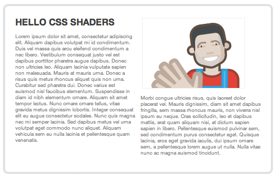
to an element whose unfiltered rendering is shown in figure 1.
2.1. Key concepts
- source texture
- The source texture is created by rendering the filtered element into
an offscreen image. The offscreen size and position (relative to the
target element's box [see
targetBox]) is controlled by the
filter region.
When a CSS shader is used in a filter graph (with an
feCustom filter primitive), the source texture is the output
of the feCustom‘s input (the
attribute).
Note that applying a ‘filter’ to an
element creates a new pseudo-stacking context, as defined
in the Filter Effects specification.
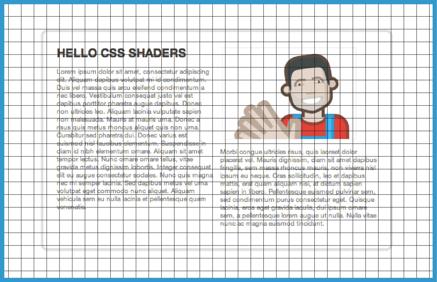
- filter region
- The filter region defines the size and position of the source texture.
In the previous figure, the blue border represents the filter region. The
filter region is the intersection of the filter
effect region and the filter
primitive subregion
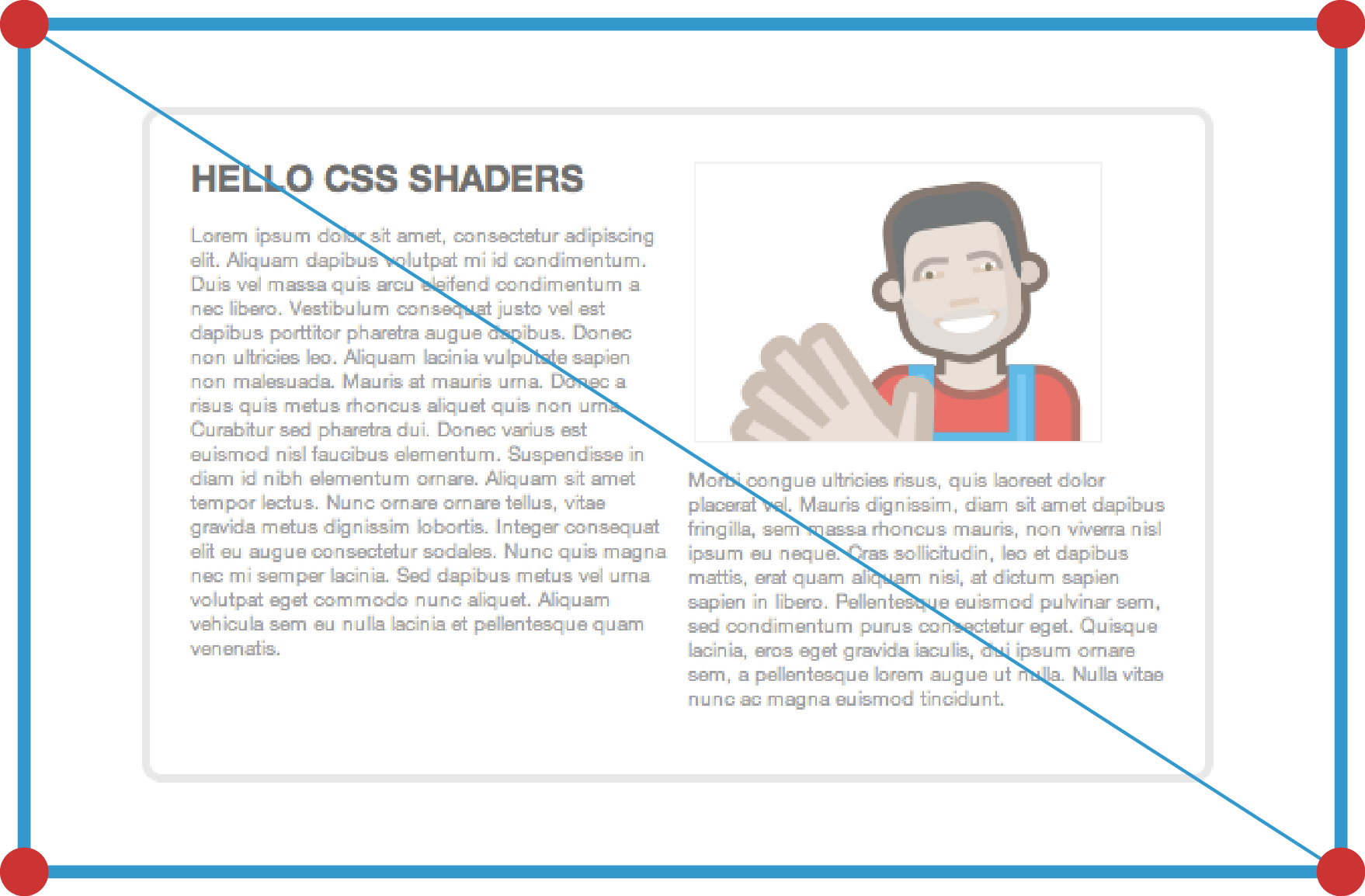
- vertex mesh
- The vertex mesh defines the geometry that is processed by the vertex
shader. By default, the extent of the vertex mesh is the same as the filter region. In the following figure, the red
markers represent the default vertices in the default vertex mesh. The
diagonal line illustrate how the vertices define two triangles.
It is possible to define a finer vertex mesh (see the
custom() function and the
'vertexMesh'
attribute).
The <box> parameter in the vertexMesh attribute
value controls if the mesh aligns with the filter region box, the
content box, the padding box or the border box.
The mesh-box is the box the mesh aligns with.
The shader mesh can either be a set of connected triangles, or a set
of disconnected triangles. This option is controlled by the detached parameter.
2.2. Model
A CSS shader defines a custom filter primitive. The following figure
illustrates its model.
The CSS shader is defined by a custom() function or an
<feCustom> filter primitive. As explained later, a
custom() function is a shorthand for defining a
<filter> element with a single
<feCustom> filter primitive. Therefore, the discussion
explains the feCustom model.
The input of the feCustom filter primitive is the same as
most of the other filter
primitives and defined by that element's ‘in’
The input of the <feCustom> filter primitive is used
as a texture on a vertex mesh. By default, the vertex mesh has the
position and size of the filter region and its granularity is controlled
by the vertexMesh
attribute on <feCustom> (and the
<vertex-mesh> parameter in the custom()
function). The creation of this vertex mesh with the input texture mapped
to the vertices is represented in the figure as the output of step 1.
The <feCustom> node processes the vertex mesh through
the vertex shader in step 2, which produces a set of transformed vertices.
This transformed vertices are the output of step 2.
During the rasterization step, the <feCustom>
primitive invokes the fragment shader for every pixel location inside the
vertex mesh to perform per pixel operation and produce the final pixel
color at that vertex mesh location. This is the output of step 3. Note
that the fragment shader may be called several time for what corresponds
to the same pixel coordinate on the output, for example when the vertex
mesh folds over itself.
Step 4 shows how this rasterized output is the input to the next step in
the filter chain (or graph, since <filter> elements can
define a graph of filters). If the <feCustom> primitive
is the last one in the filter chain, then this output is the filtered
rendering of the element. Otherwise, the output of the primitive becomes
the input to the next filter primitive using it.
The CSS fragment shaders processing model follows the Filter
Effects 1.0 specification with regards to how
filters apply to HTML and how the filter
region is computed.
One issue with filter effects is
the impact on interactivity. Filters can offset the visual rendering of
content and affect the way users interact with content. For example, the
feOffset
element moves the element's rendering by a given offset, which biases the
interaction: the end user may click on an element and actually hit a
different one because of the offset. This issue is expected to be more
acute with vertex shaders and the working group should consider a general
solution to this issue that works for both predefined filter effects and
custom ones.
3. Integration in Filter
Effects 1.0
This document provides a definition for the feCustom element in the Filter Effects specification.
It also defines the ‘custom()’ function for use
in the ‘filter’ property.
3.1. The
custom() function
The custom() function has the following syntax:
custom(<vertex-shader>[wsp<fragment-shader>][,<vertex-mesh>][,<params>])
-
<vertex-shader>
| <uri> | none
|
<fragment-shader>
| <uri> | none
|
<vertex-mesh>
| +<integer>{1,2}[wsp<box>][wsp'detached']
where: <box> = filter-box | border-box | padding-box |
content-box
|
<params>
| See the <feCustom>‘s params
attribute.
|
The custom() function is a shorthand for the following
filter effect:
<filter>
    <feCustom vertexShader="vertex-shader"
              fragmentShader="fragment-shader"
              vertexMesh="vertex-mesh"
              params="params"/>
</filter>
It can be used in combination with other filter shorthands, for example:
filter: sepia(0.5) custom(none url(add.fs), amount 0.2 0.2
   0.2);
It might be clearer to name the custom()
function the shader() function instead and introduce an
feCustomShader filter primitive instead of
feCustom.
3.2. The feCustom
element
The Filter
Effects specification does not define the feCustom
element. This document proposes the following definition.
‘feCustom’
- Content model:
- Any number of the following elements, in any order:
- Attributes:
-
- vertexShader:
<uri>
- The shader at <uri> provides the implementation for the
feCustom vertex shader. If the shader cannot be retrieved,
or if the shader cannot be loaded or compiled because it contains
erroneous code, the shader is a pass
through. Otherwise, the vertex shader is invoked for all the vertex
mesh vertices.
- fragmentShader:
<uri>
- The shader at <uri> provides the implementation for the
feCustom fragment shader. If the shader cannot be
retrieved, or if the shader cannot be loaded or compiled because it
contains erroneous code, the shader is a pass
through. Otherwise, the fragment shader is invoked for each of the
pixels during the rasterization phase that follows the vertex shader
processing.
- vertexMesh:
+<integer>{1,2}[wsp<box>][wsp’detached']
- See the vertexMesh attribute
discussion
- params:
[<param-def>[,<param-def>*]]
- Parameters are passed as uniforms to both the vertex and the
fragment shaders.
| <param-def>
| <param-name>wsp<param-value>
|
| <param-name>
| <ident>
|
| <param-value>
| true|false[wsp+true|false]{0-3} |
<number>[wsp+<number>]{0-3} |
<array> |
<transform> |
<texture(<uri>)>
|
| <array>
| ‘array(’<number>[wsp<number>]*‘)’
|
| <transform>
| <css-3d-transform> | <mat>
|
| <css-3d-transform>
| <transform-function>;[<transform-function>]*
|
| <mat>
| ‘mat2(’<number>(,<number>){3}‘)’ |
‘mat3(’<number>(,<number>){8}‘)’ |
‘mat4(’<number>(,<number>){15}‘)’ )
|
There are two ways to specify a 4x4 matrix. They differ in how they are
interpolated.
The <mat> values are in column major order. For
example, mat2(1, 2, 3, 4) has [1, 2] in the
first column and [3, 4] in the second one.
There may be different ways to specify the
<param-value> syntax. For example, it might be better to not have a
texture() function and simply a <uri> for texture
parameters. Or it might be better to not have a mat<n>
prefixes for matrices.
The following document
from Mozilla describes how WebGL vertex and fragment shaders can be
defined in <script> elements.
CSS shaders can reference shaders defined in
<script> elements, as shown in the following code
snippet.
<script id="warp" type="x-shader/x-vertex" >
<-- source code here -->
</script>

..
<style>
.shaded {
    filter: custom(url(#warp));
}
3.2.1. The ‘vertexMesh’ attribute
The <feCustom>‘s
’vertexMesh' attribute defines the granularity of vertices in the
shader mesh. By default, the vertex mesh is
made of two triangles that encompass the filter
region area.
+<integer>{1,2}[wsp<box>][wsp'detached']
- One or two positive integers (zero is invalid) indicating the
additional number of vertex lines and columns that will make the vertex
mesh. With the initial value of ‘
1 1’ there is
a single line and a single column, resulting in a four-vertices mesh
(top-left, top-right, bottom-right, bottom-left). If only one value is
specified, the second (columns) value computes to the first value. In
other words, a value of ‘n’ is equivalent
to a value of ‘n n’.
A value of ‘n m’ results in a vertex mesh that
has ‘n’ lines and ‘m’ column and a total of ‘n +
1’.‘m + 1’ vertices as illustrated in
the following figure.
The optional <box> parameter defines the box on which the vertex
mesh is stretched to. It defaults to the ‘filter-box’ value which is ‘border-box’ with the added filter margins. For
elements that do not have padding or borders (e.g., SVG elements), the
values ‘padding-box’ and ‘border-box’ are equivalent to ‘content-box’. For SVG elements, the ‘content-box’ is the object bounding box.
The optional ‘detached’ string
specifies whether the mesh triangles are attached or detached. If the
value is not specified, the triangles are attached. If ‘detached’ is specified, the triangles are
detached. When triangles are attached, the geometry provided to the
vertex shader is made of a triangles which share adjacent edges'
vertices. In the ‘detached’ mode, the
triangles do not share edges.
In the following figure, let us consider the top-left ‘tile’ in the shader mesh. In the detached mode,
the vertex shader will receive the bottom right and top left vertices
multiple time, one of each of the two triangles which make up the tile.
Otherwise, the shader will receive these vertices only once, because
they are shared by the ‘connected’
triangles.
See the discussion on uniforms passed to shaders to understand how the
shader programs can leverage that feature.
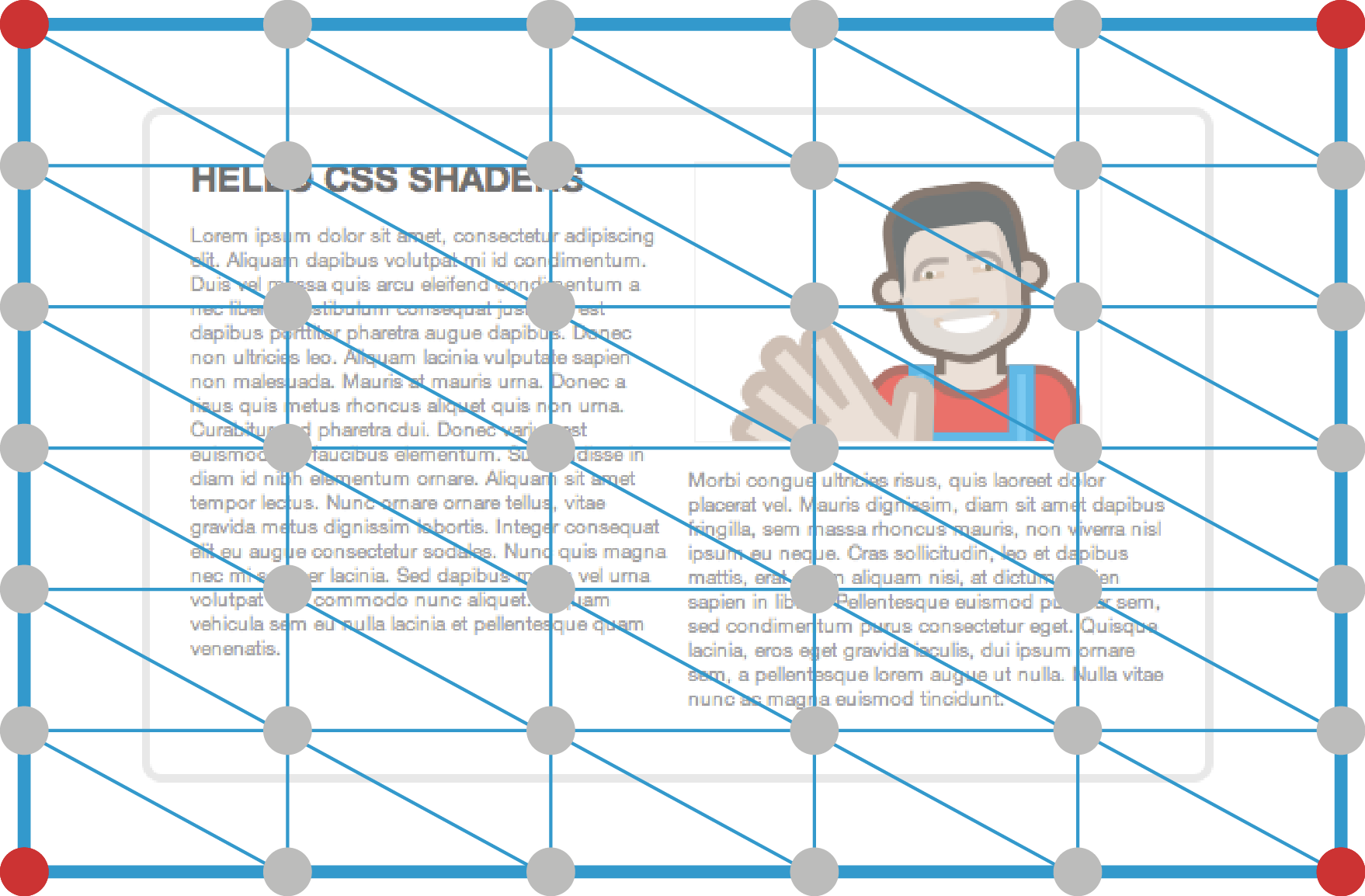
The above figure illustrates how a ‘vertexMesh’ value of ‘5
4’ adds vertices passed to the vertex shader. The red vertices
are the default ones and the gray vertices are resulting from the ‘vertexMesh’ value.
The following example applies a vertex shader (‘distort.vs’) to elements with class ‘distorted’. The vertex shader will operate on a
mesh that has 5 lines and 4 columns (because there are 4 additional lines
and 3 additional columns).
    <style>
    .distorted {
        filter: custom(url(distort.vs), 4 3);
    }
    </style>

    ...
    <div class="distorted">
    ..
    </div>
which could also be written as:
<style>
.distorted {
    filter: url(#distort);
}
</style>

...

<filter id="distort">
    <feCustom vertexShader="url(distort.vs)" vertexMesh="4 3" />
</filter>

<div class="distorted">
..
</div>
When an feCustom filter primitive is used in a filter
graph, a ‘texture’ parameter can take a
value of ‘result(<name>)’ where ‘name’ is the output of another filter primitive.
<filter>
    <feGaussianBlur stdDeviation="8" result="blur" />
    <feTurbulence type="fractalNoise" baseFrequency="0.4" numOctaves="4" result="turbulence"/>
    <feCustom fragmentShader="url(complex.fs)" params="tex1 result(blur), tex2 result(turbulence)" />
</filter>
4. Properties
There are current
discussions in the FX task force about computing filter regions
automatically. CSS shaders add a new requirement to that discussion,
because it may be non-trivial to compute the filter region of a custom
filter automatically.
The ideal solution, from an authoring perspective, is to define how to
compute filter regions automatically to create the desired effect in all
cases, including custom filters. The proposed filter margin properties,
specified below, would not be required if a solution to the automatic
computation of filter region is found and agreed upon.
4.1. Filter margins
properties: ‘filter-margin-top’, ‘filter-margin-bottom’, ‘filter-margin-left’, ‘filter-margin-right’, and ‘filter-margin’
The ‘filter-margin’ properties define
the filter
effect region for filters defined with filter functions such as the
‘custom()’ function defined in this document.
If the filter property references a <filter> element,
then the filter effect region defined by the element takes precedence over
the ‘filter-margin’ property.
On a regular <filter> element, the x, y, width and
height attributes define the filter
effects region.
The following sections describe the ‘filter-margin-top’, ‘filter-margin-left’, ‘filter-margin-bottom’, ‘filter-margin-right’ properties.
The filter-margin properties are a shorthand mechanism for defining a
filter region equivalent to:
<filter filterUnits="objectBoundingBox"
        x="fx(targetBox, [filter-margin-left])"
        y="fy(targetBox, [filter-margin-top])"
        width="fw(targetBox, [filter-margin-left], [filter-margin-right])"
        height="fh(targetBox, [filter-margin-top], [filter-margin-bottom])">
    <!-- filter primitives for the filter function -->
</filter>
Where:
targetBox = borderBox | objectBoundingBox
borderBox is the element's generated border box
dimensions for elements subject to CSS Visual Formatting, such as HTML
elements (see [CSS21]).
objectBoundingBox is the element's object
bounding box.
fx(box, left) = - (left / box.width)
fy(box, top) = - (top / box.height)
fw(box, left, right) = ((box.width + left + right) /
    box.width)
fh(box, top, bottom) = ((box.height + top + bottom) /
    box.height)
Margin properties specify the width of the filter region of
a box. The ’filter-margin’ shorthand property sets the margin for all
four sides while the other margin properties only set their respective
side. These properties apply to all elements (which is different from the
regular margin properties where vertical margins will not have any effect
on non-replaced inline elements).
The ‘filter-margin-top’, ‘filter-margin-bottom’, ‘filter-margin-left’, ‘filter-margin-right’ can take the same values are
the ‘margin-top’, ‘margin-bottom’, ‘margin-left’ and ‘margin-right’ properties, respectively. In
addition, they can take the ‘auto’ value
which is also their default value.
The ‘filter-margin’ property can take
the same values as the ‘margin’ property
and is a shorthand for setting ‘filter-margin-top’, ‘filter-margin-right’, ‘filter-margin-bottom’ and ‘filter-margin-left’ at the same place in the
stylesheet.
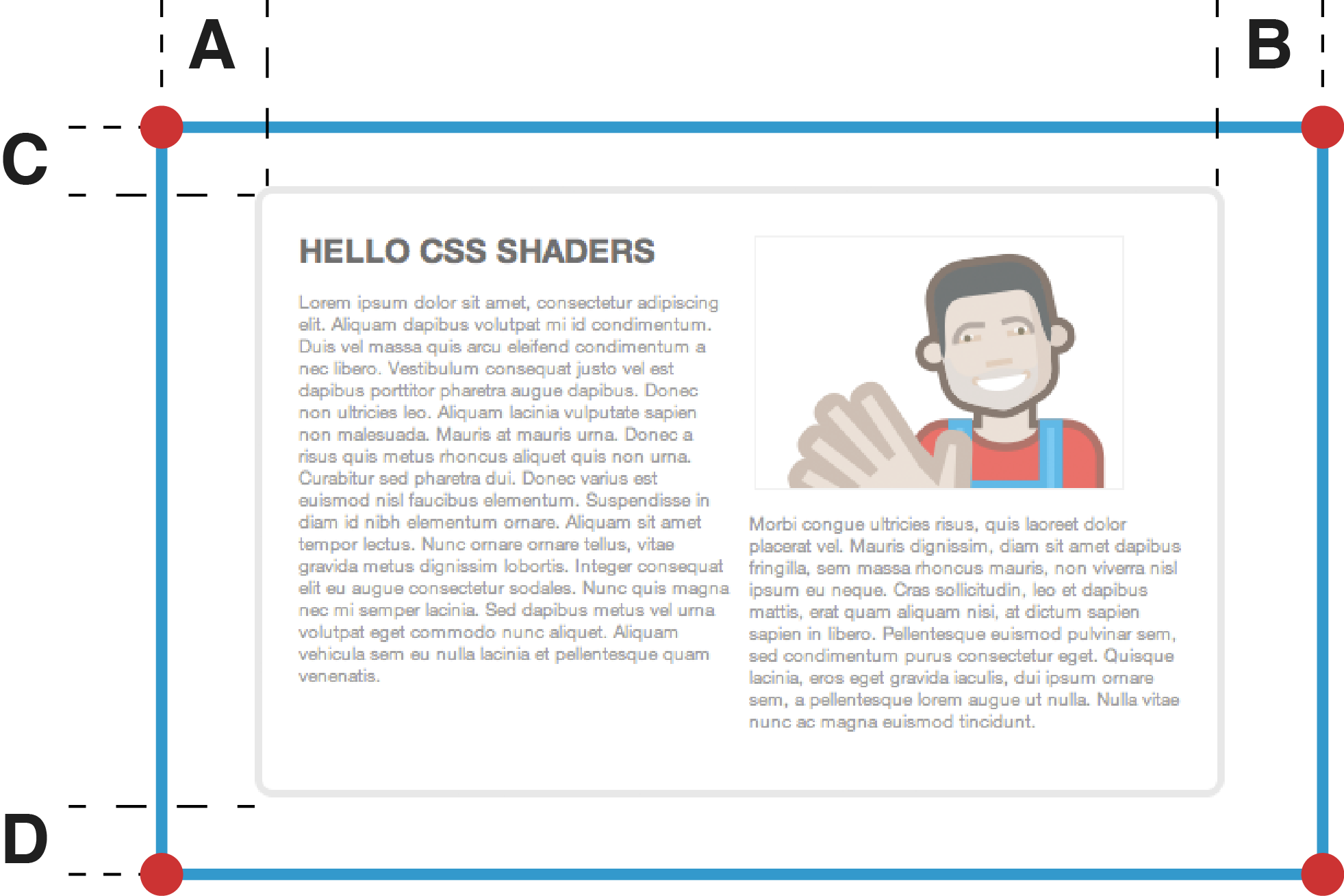
The following figure illustrates how the various filter-margin
properties affect the filter region.
The blue border delimit the filter region. The margins are represented
by:
- A: filter-margin-left
- B: filter-margin-right
- C: filter-margin-top
- D: filter-margin-bottom
| Name:
| filter-margin-top,
filter-margin-right, filter-margin-bottom, filter-margin-left
|
| Value:
| <margin-width> | inherit | auto
|
| Initial
| auto
|
| Applies to:
| all elements
|
| Inherited:
| no
|
| Percentages:
| refer to the containing block
|
| Media:
| visual
|
| Computed value:
| the percentage as specified or the absolute length. A value of auto
computes to 10% of the targetBox
|
5.
Integration with CSS Animations and CSS Transitions
The attributes and properties defined in this document can be subject to
animation as any other attribute or CSS property.
Even though the Filter Effects specification does not clarify that
point, this document assumes that the ‘filter’ property can be animated and that
interpolation happens between the filter functions only if the ‘filter’ values have the same number of filter
functions appearing in the same order.
5.1.
Interpolating the shader-params component in the custom() function.
To interpolate between params
values in a custom() filter function or between
<feCustom> ‘params’ attribute values, the user agent
should interpolate between each of the [param-def] values according to its type.
List of values need to be of the same length. Matrices need to be of the
same dimension. Arrays need to be of the same size.
Interpolation between shader params only happens if all the
other shader properties are identical: vertex shader, fragment shader,
filter margins and vertex mesh.
<number>[wsp<number>{0-3}]
| Interpolate between each of the values.
|
<true|false>[wsp<true|fals>{0-3}]
| Interpolate between each of the values using a step function.
|
<array>
| Interpolate between the array elements.
|
<css-3d-transform>
| Follows the CSS 3D
transform interpolation rules.
|
<mat>
| Interpolate between the matrix components (applies to mat2, mat3 and
mat4).
|
As with the ‘transform’
property, it is not possible to animate the different components of the
‘shader-params’ property on different
timelines or with different keyframes. This is a generic issue of
animating properties that have multiple components to them.
6. Shading language
6.1. Precedents
There are many precedents for shading languages, for example:
6.2. Recommended shading
language
This document recommends the adoption of the subset of GLSL
ES defined in the WebGL 1.0
specification.
In particular, the same restrictions as defined in WebGL should apply to
CSS shaders:
All the parameters specified in the <shader-params>
values (e.g., the feCustom's param attribute or the
custom(<uri>, <shader-params>) filter function or
the shader property value) will be available as uniforms to
the shader(s) referenced by the ‘shader’
property.
The group may consider applying further restrictions to the GLSL ES
language to make it easier to write vertex and fragment shaders.
The OpenGL ES shading language provides a number of variables that can
be passed to shaders, exchanged between shaders or set by shaders. In
particular, a vertex shader can provide specific data to the fragment
shader in the form of ‘varying’ parameters
(parameters that vary per pixel). The following sections describe
particular variables that are assumed for the vertex and fragment shaders
in CSS shaders.
Even though this document recommends the GLSL ES shading
language, there are other possible options to consider, for example:
- Allow multiple shading languages, present or future (similar to how
the <script> tag allows different scripting languages).
- Define a shading language specific to custom filter effects.
The implementation could use the mime type of the url or <script>
element to determine the the shading language.
6.2.1. Vertex
attribute variables
The following attribute variables are available to the vertex shader.
attribute vec4 a_position
| The vertex coordinates in the filter
region box. Coordinates are normalized to the [-0.5, 0.5] range
along the x, y and z axis.
|
attribute vec2 a_texCoord;
| The vertex's texture coordinate. Coordinates are in the [0, 1] range
on both axis
|
attribute vec2 a_meshCoord;
| The vertex's coordinate in the mesh box.
Coordinates are in the [0, 1] range on both axis.
|
attribute vec3 a_triangleCoord;
|
The x and y values provide the coordinate of the current ‘tile’ in the shader mesh. For example, (0, 0)
for the top right tile in the mesh. The x and y values are in the [0,
mesh columns] and [0, mesh rows] range, respectively.
The z coordinate is computed according to the following figure. The
z coordinate value is provided for each vertex and corresponding
triangle. For example, for the bottom right vertex of the top
triangle, the z coordinate will be 2. For the bottom right vertex of
the bottom triangle, the z coordinate will be 4.
|
The following uniform variables are set to specific values by the user
agent:
uniform mat4 u_projectionMatrix
| The current projection matrix to the destination texture's
coordinate space). Note that the ‘model
matrix’ which the ‘transform’
property sets, is not passed to the shaders. It is applied to the
filtered element's rendering.
|
uniform sampler2D u_texture
| The input texture. Includes transparent margins for the filter
margins.
|
uniform sampler2D u_contentTexture
| A texture with the rendering of the filtered element. If the filter
is the first in the filter chain, then, this texture is the same as the
u_texture uniform. However, if there are preceding filters, this
provides the rendering of the original filtered element, whereas
u_texture provides the output of the preceding filter in the filter
chain (or graph).
|
uniform vec2 u_textureSize
| The input texture's size. Includes the filter margins.
|
uniform vec4 u_meshBox
| The mesh box position and size in the filter
box coordinate system. For example, if the mesh box is the filter
box, the value will be (-0.5, -0.5, 1, 1).
|
uniform vec2 u_tileSize
| The size of the current mesh tile, in the same coordinate space as
the vertices.
|
uniform vec2 u_meshSize
| The size of the current mesh in terms of tiles. The x coordinate
provides the number of columns and the y coordinate provides the number
of rows.
|
6.2.3. Varyings
When the author provides both a vertex and a fragment shader, there is
no requirement on the varyings passed from the vertex shader to the
fragment shader. If no vertex shader is provided, the fragment shader can
expect the v_texCoord varying. If no fragment shader is
provided, the vertex shader must compute a v_texCoord varying for the
default shaders.
| varying vec2 v_texCoord;
| The current pixel's texture coordinates (in u_texture).
|
When there parameters are passed to the custom() filter
function or the feCustom filter primitive, the user agent
pass uniforms of the corresponding name and type to the shaders.
The following table shows the mapping between CSS shader parameters and
uniform types.
| CSS param type
| GLSL uniform type
|
| true|false[wsp+true|false]{0-3}
| bool, bvec2, bvec3 or bvec4
|
| <number>[wsp+<number>]{0-3}
| float, vec2, vec3 or vec4
|
| <array>
| float[n]
|
| <css-3d-transform>
| mat4
|
‘mat2(’<number>(,<number>){3}‘)’ |
‘mat3(’<number>(,<number>){8}‘)’ |
‘mat4(’<number>(,<number>){15}‘)’
| mat2, mat3 or mat4
|
| texture(<uri>)
| sampler2D
|
The following code sample illustrates that mechanism.
CSS

.shaded {
    filter: custom(
                   url(distort.vs) url(tint.fs),
                   distortAmount 0.5, lightVector 1.0 1.0 0.0,
                   disp texture(disp.png)
                );
}

Shader (vertex or fragment)
...

uniform float distortAmount;
uniform vec3 lightVector;
uniform sampler2D disp;
uniform vec2 dispSize;
...
As illustrated in the example, for each <textureName>
texture() parameter, an additional vec2 uniform is
passed to the shaders with the size of the corresponding texture.
6.2.5. Default shaders
If no vertex shader is provided, the default one is as shown below.
attribute vec4 a_position;
attribute vec2 a_texCoord;

uniform mat4 u_projectionMatrix;

varying vec2 v_texCoord;

void main()
{
    v_texCoord = a_texCoord;
    gl_Position = u_projectionMatrix * a_position;
}
If no fragment shader is provided, the default one is shown below.
varying vec2 v_texCoord;
uniform sampler2D u_texture;

void main()
{
    gl_FragColor = texture2D(u_texture, v_texCoord);
}
6.2.6. Texture access
If shaders access texture values outside the [0, 1] range
on both axis, the returned value is a fully transluscent black pixel.
6.3. Security
considerations
Since vertex and fragment shaders are programs that would be executed by
the user agent, it is important to consider the security implications.
The same efforts
made on making WebGL highly secure would apply to CSS shaders, since this
document proposes to share the same shading language.
In addition, CSS shaders offer a restricted environment for shaders.
Scripts have no access to the shaders output and no communication is
possible between the shaders and the page's scripts or external servers.
Possible denial of service attack are a concern. There are active efforts
to address these issues for WebGL and these efforts would apply to CSS
shaders.
In addition, the group may consider adding restrictions on the number of
parameters allowed for shaders, as well as the size of input textures,
vertex mesh size and number of shader parameters.
The working group should decide on restrictions that will apply to
shaders, to avoid information leakage. Timing attack
are an example of a method to compute the content pixel values without
having actual API access to the pixel values. However, it seems difficult
to mount such an attack with CSS shaders because the means to measure the
time taken by a cross-domain shader are limited.
The group could decide to limit the cross domain usage of shaders or
shader textures, and only permit the use of same domain shaders and
textures or only allow those validated through Cross Origin Resource Sharing.
Acknowledgments
Many thanks to Mihnea Vlad-Ovidenie, Alexandru Chiculita and Andrei
Valentin Onea for their help defining and prototyping the features
proposed in this note. Thanks to Ken Russell for his input and discussion
about WebGL. Thanks to Benoit Jacob and Robert OCallahan for the
discussion on security, parameter typing and filter margins and some WebGL
precedents.
Thanks to Ben Schwarz and Jerrold Maddox for their guidance creating a
legible design for this specification proposal. Any remaining design
errors would be the editors failure to follow their recommendations.
Change Log
6.4. October 19 2011
- Added ‘
detached’ mode proposal for
shader mesh.
- Added new uniforms: u_contentTexture, u_tileSize, u_tilePos,
u_meshSize
- Added new attribute: a_triangleCoord.
- Issue
01: changed shaderMesh to be the number of lines and columns instead
of the number of additional lines and columns.
- Issue
03: added a note at the end of the
model section.
- Feedback
from Chris Marrin: added references to WebGL restrictions.
- Renamed s_texture to u_texture for consistency, since uniforms are
prefixed with ‘
u_’
References
Normative references
-
- [CSS21]
- Bert Bos; et al. Cascading Style
Sheets Level 2 Revision 1 (CSS 2.1) Specification. 7 June
2011. W3C Recommendation. URL: http://www.w3.org/TR/2011/REC-CSS2-20110607
Other references
-
- [CSS3-TRANSITIONS]
- Dean Jackson; et al. CSS
Transitions. 3 April 2012. W3C Working Draft. (Work in
progress.) URL: http://www.w3.org/TR/2012/WD-css3-transitions-20120403/
Index
- filter-margin-top, filter-margin-right, filter-margin-bottom,
filter-margin-left, 4.1.
Property index
| Property
| Values
| Initial
| Applies to
| Inh.
| Percentages
| Media
|
| filter-margin-top, filter-margin-right, filter-margin-bottom, filter-margin-left
| <margin-width> | inherit | auto
|
| all elements
| no
| refer to the containing block
| visual
|